Methods of Contextualizing
Group
Samuel Christopher Ng
Emily Howard
Zhang Yufei
Tang (Bert) Jiabao
Brief
We examined a communication tool that we engage regularly, identified barriers that inhibit full participation of disabled/neurodiverse people. We attempted to reimagine the tool to enable broader participation.
At the beginning of the project, each of us decided each of our own usual medium that we work with, analyze to see which group of people it is unaccessible to, then try to recontextualize them to be more inclusive. Me and Emily selected Typography as our medium, while Bert selected the underground tube map system. Yufei did more research and analysis on the stories from the required reading.
We figured with Yufei’s research, we could put together a narrative or content, in which the form of a medium we decide to go for after the first meeting will contain.
To summarize, in Alice Wong’s book, “Disability Visibility”, contains first-hand stories from the often overlooked experience of disabled and neurologically diverse people. Most people experience a great deal of shame and discrimination as a result of their disabilities.
At the same time, the society of able-bodied people have as much rights and dignitity as disabled people. We decided to design something to break the barrier of communication that causes discrimination towards the disabled community.
Ease of communication for neurodivergent and disabled community empowers self expression
and actualization
Wong, A. (ed.) (2020) Disability Visibility: First-Person Stories From the Twenty-First Century. New York: Knopf Doubleday Publishing Group

Braille, Boston line type, etc., are some of the options used to aid the visually impaired to communicate and receive information. These mediums lack the elements conventional typography has such as its style and feel.
Expanding on the commonly used braille with materials, textures, and even temperature could elevate writing expression from blind people.
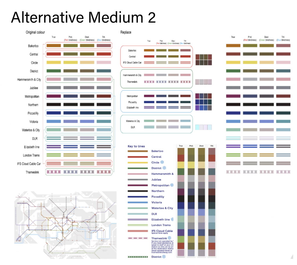
The lines of the map of London are so complex that it is difficult to find the correct route without being colour blind. And people with colour blindness will see routes with similar or repeated colours and will be even more confused. Bert explores a whole new color palette and experimenting the use of patterns as the substitute to colors.
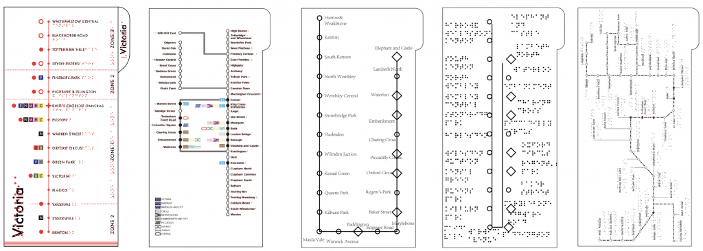
After the first meeting with the tutors, we decided to combine the exploration of expressive braille in a map format. We wanted to make sure that the things we designed were actually useful to our target group, so, within the time constraint, we worked on a first draft of map modules all the while we interviewed Pete Osborne for his perspective as a blind person.
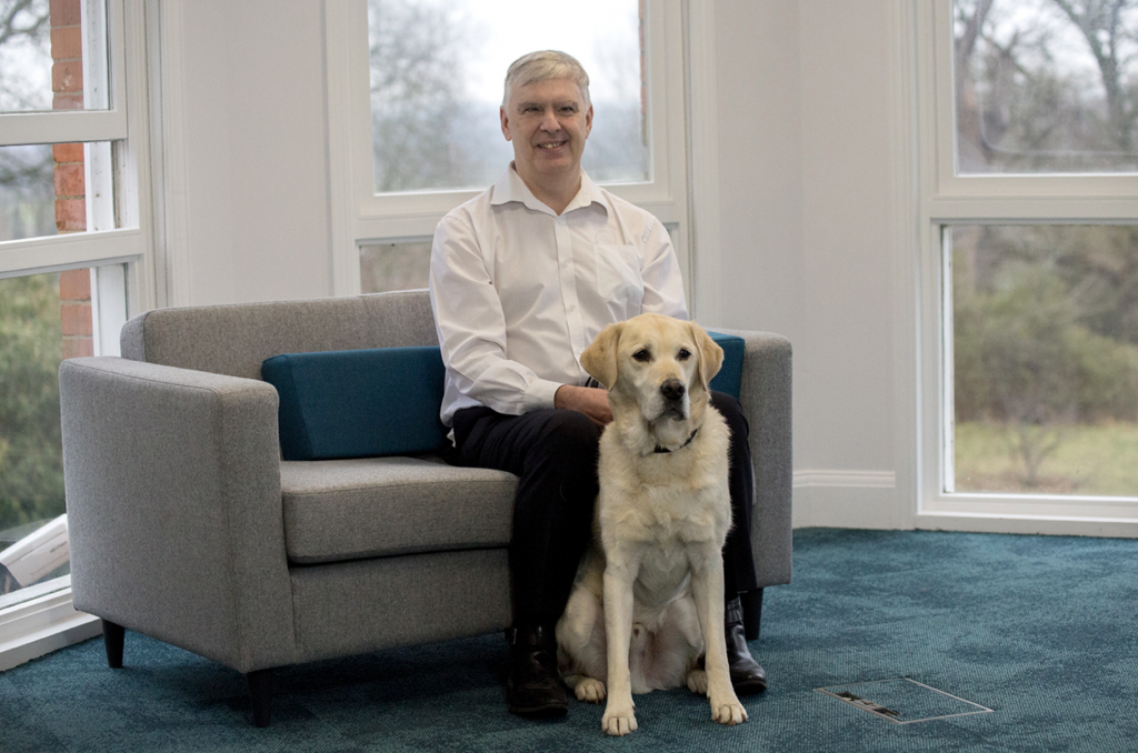
Interview
The interview via email went well, but unfortunately we did not get the answers we expected. Turns out commuting via underground in London is very different for blind people. The use of maps is unaccessible to them. Blind people in general prefer to plan ahead before commuting with the assistance of caretakers or digital maps on smartphones using voice commands.
Would tactile maps of the underground be helpful?
“Honestly, no. I don’t think there is any substitute for good planning in advance of setting out on a route and there are many online/other ways to achieve this.”
“I have rarely used a tactile tube map as,
in reality, I don’t have the commuter time
to stand and work them out.”PETE OSBORNE
Deputy Chief Executive Officer
Guide Dogs UK
Week 2
Slightly bummed out, we decided to scratch our handy map idea and decided to try something new. Using the information and ideas we have so far, we decided to try to reimagine the poster medium.
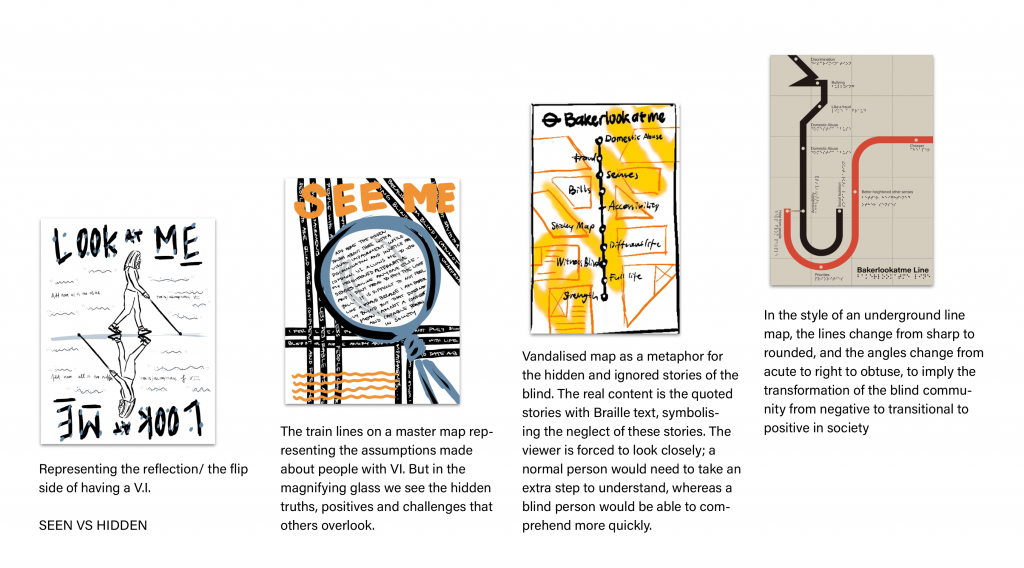
Posters are highly visual and, quite straight-forwardly, not something a blind person would gain anything out of. It is usually purely 2 dimensional, and designed to be seen from a distance. What if we experiment on a poster accesible to the visually impaired?
At the same time, we tried to continued using the narrative we built from week 1: the disconnect between the normal and disabled resulted in the neglect and discrimination of one side. We thought of producing a medium where both sides can communicate to each other, in hopes to build empathy, and equality.
We collected stories from the web from blind people and their experiences, bad and good. We wanted a balanced view to represent the blind community’s lives holistically. We compiled them into quotes, then created some ways to visualize them.
Final Result
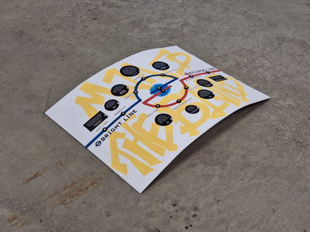
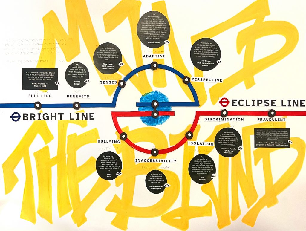
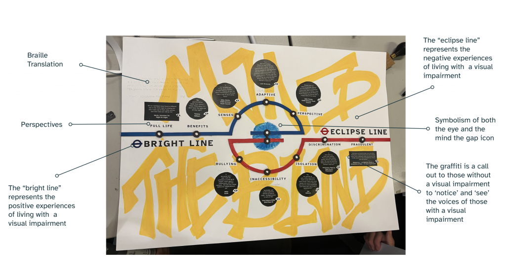
A universally legible poster highlighting the dual positive and negative experience of those with a visual impairment.
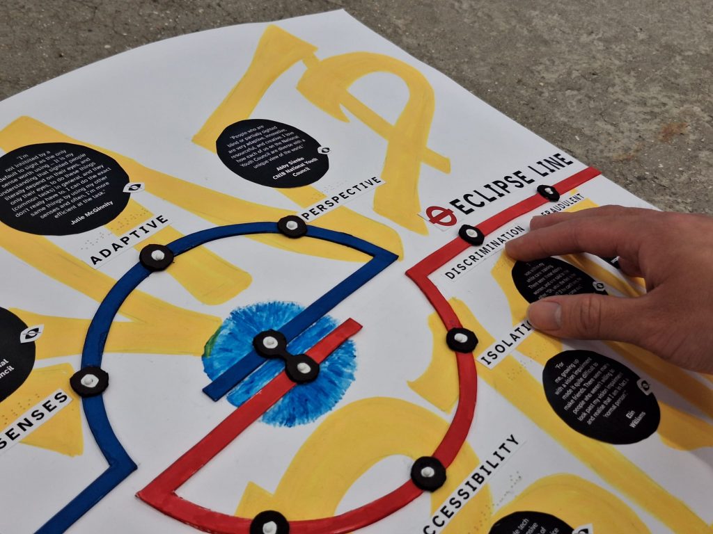
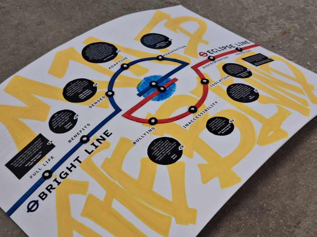
This is a poster for a tube station representing experiences through different ‘lines’ that converge as one in the shape of an eye.
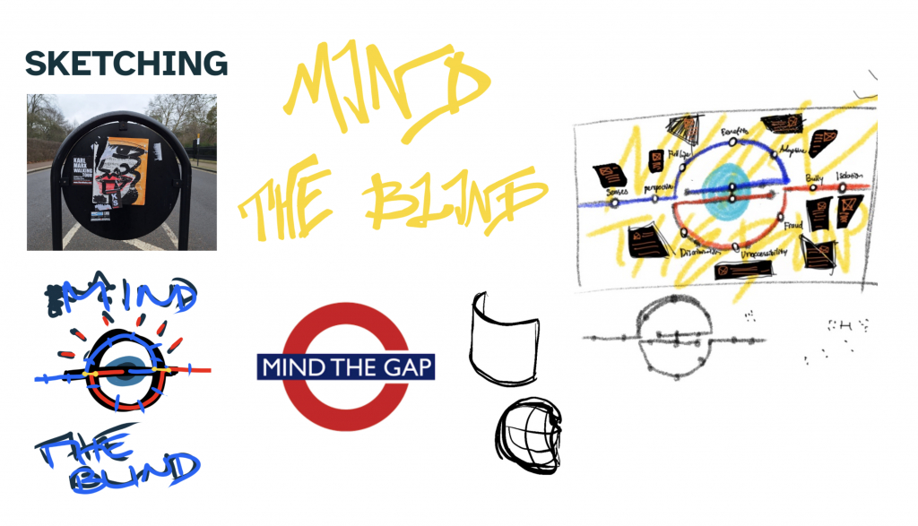

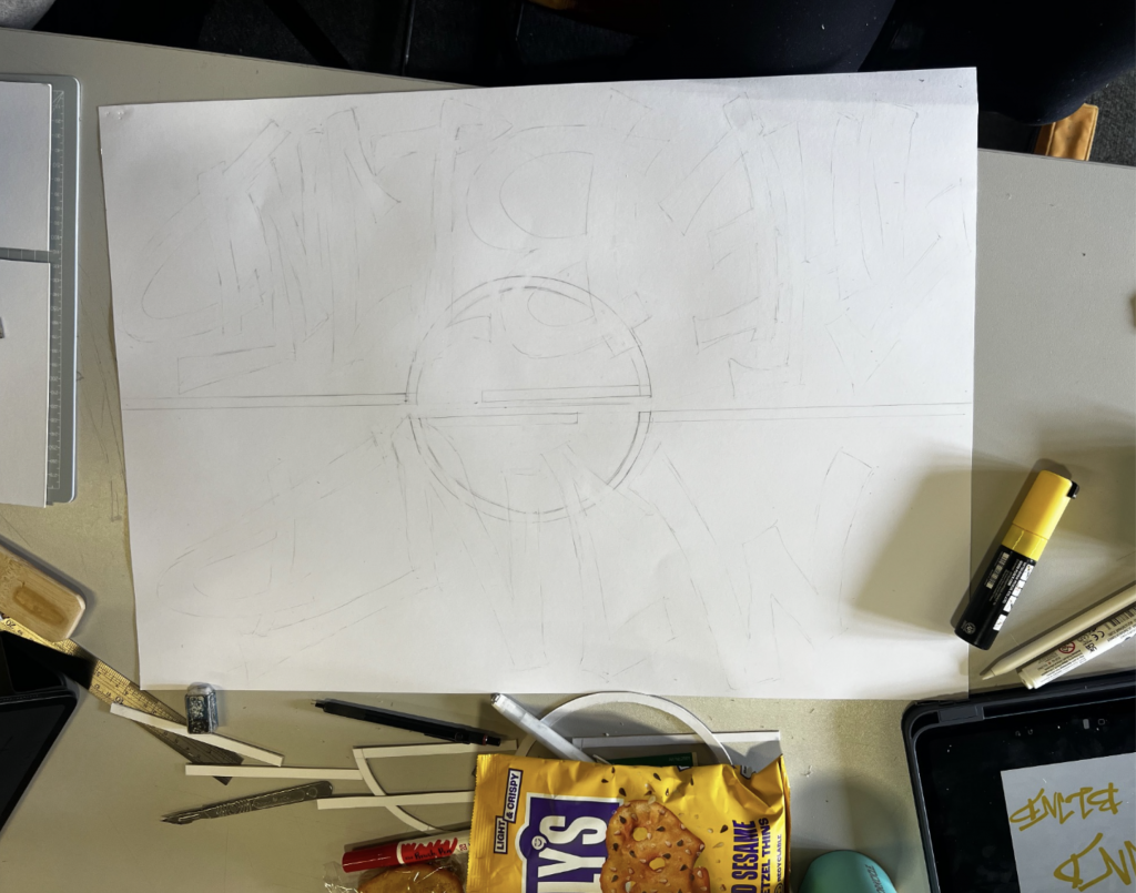
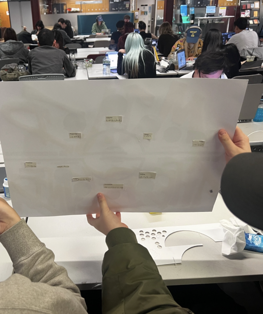

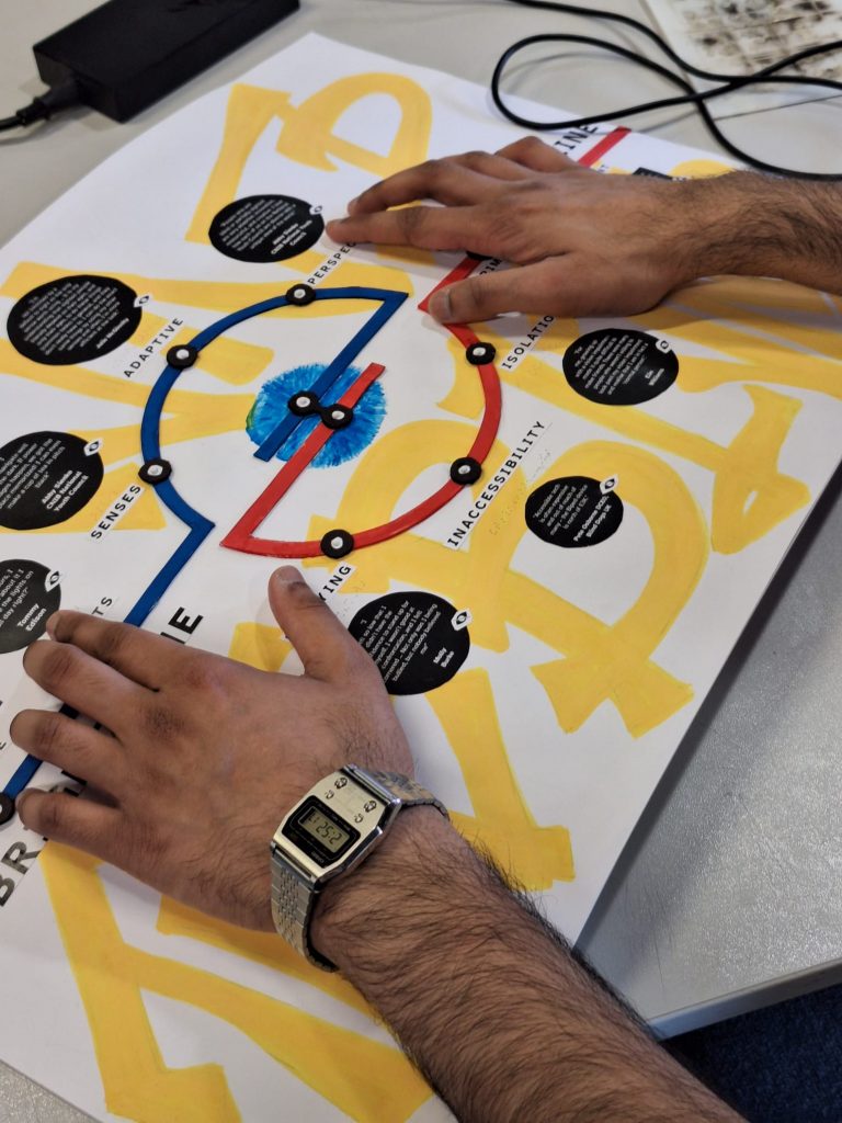
This is the final prototype of the poster. The poster has two sides of interpreting based on visual abilities. For the visual people, they’ll see a crowded vandalized underground map-style graphic, representing the neglected stories of the blind. Two lines converging in the center in a shape referring to the underground logo with each station representing stories of the blind people often overlooked.
For the blind, the lines are elevated so it can be followed by touch. They won’t see the grafitti, but will feel the braille on each words there, guided by the lines. The bright line represents the good experiences, while the eclipse line represents the bad. The whole poster is slightly curved to be ergonomic.
Reflections
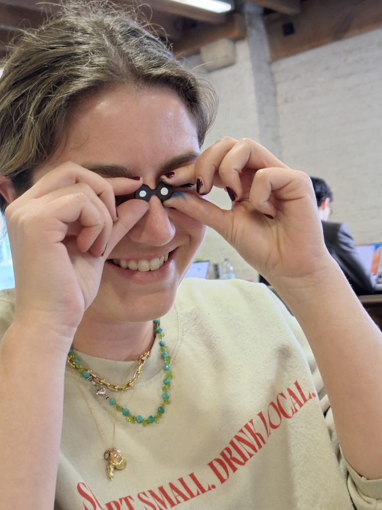
It was insightful to learn about the stories and discover how much accessibility impacts the disabled and neurodiverse people in self expression and communication. It was also fun to explore the different rules to follow in graphic design with the “visual” aspect taken out of it for the sake of the visually impaired. It seems that the poster is trying to juggle too many things at once, and perhaps defeated its main purpose of giving the visually impaired a voice. There is much more potential to be explored, within the right context, for the poster. Perhaps, a poster solely catering to blind people could result in a more insightful and touching result, even to normal people.
Leave a Reply