Debbie is Lost!
In this workshop, Rebecca Ross led us to explore the applications of graphic design in a communal context. We can see the difference when graphic design as a discipline is applied in this way, compared to when it is geared towards commercial means. There seems to be a shift in style and standard. The shift ofcourse is determined by the different goals and therefore means to get there. For instance, while commercial works generally are made with refinement in an almost homogenized style, communal artworks are simple and innocent in comparison. They have their own charm in a very niche way, targeted to a small group based on occupation, or area. The most interesting case study mentioned in the workshop was a poster promoting its author as a drummer for any band who might want to recruit him. It was a simple A4 written with a marker. Despite its plain appearance, it stood out because of its size compared to the tiny stickers on the pole, and oddly enough had a typographic hierarchy.
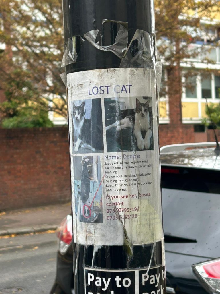
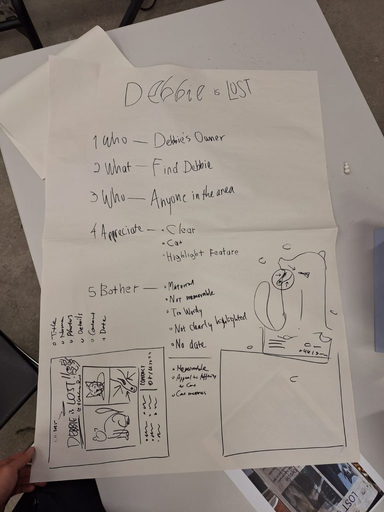
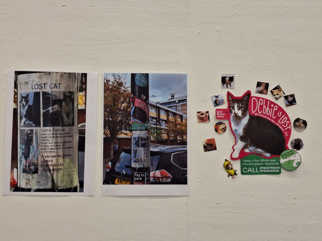
We were then tasked to head out and find an existing communal poster within the CSM area, and redesign it, seeing if we could improve on it. I was paired up with Zhang Wannie and we selected a missing cat poster. We broke down the intention, target audience, etc. of the poster. Due to its function for passerbys to see and remember how Debbie looks like, in hopes that they may recognize her later on in their travels.
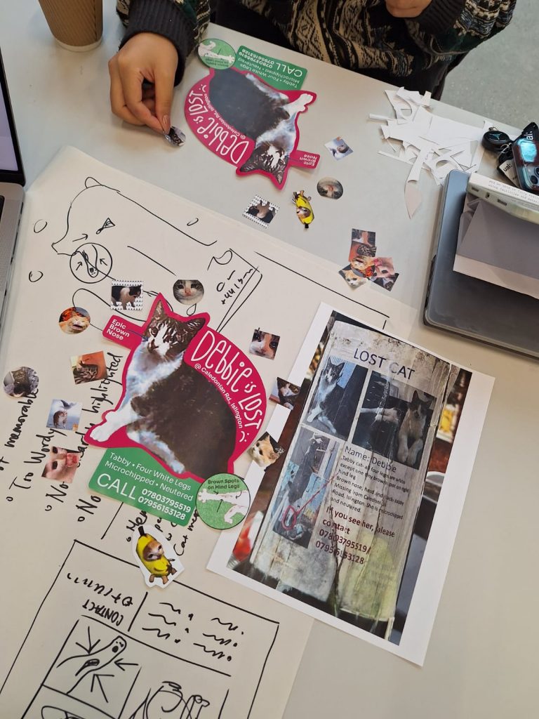
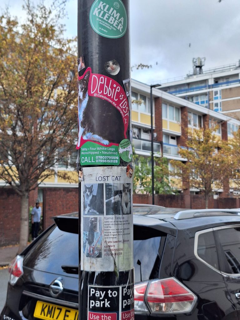
We therefore pivoted on the poster’s function to be memorable to pedestrians. We capitalized on viral cat memes to grab attention, used vibrant colors, and focused on Debbie’s appearance. The odd shape of the poster should also attract attention.
Leave a Reply